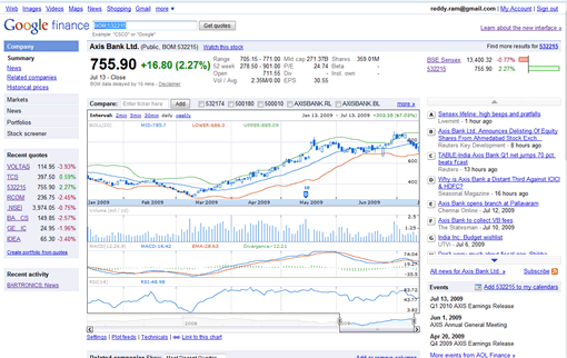
Yahoo Finance is the leading financial web site and always Google Finance lagged behind Yahoo Finance in terms of usefulness, charts, technical indicators. Today I was greeted with a new design of Google Finance, interestingly no major blog has covered this yet. The revamped Google Finance provides a good alternative to Yahoo Finance. The most significant change is the left navigation which provides shortcuts to portfolios, recent quotes you viewed, and a link to stock screener. The recent quotes on the left navigation are streamed real-time where available so they are quite useful as you can see them from any page in Google Finance.

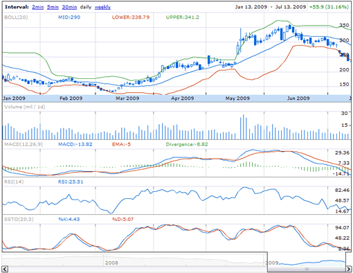
The other major changes include plotting technical indicators line Bollinger Bands, Simple Moving Averages, Exponential Moving Averages, Stochastic Oscillators etc. Click on the technicals link under the chart to see the available technical indicators. You can define the periods for the technical indicators. Currently Supported technicals include Simple Moving Averages, Exponential Moving Averages, Moving Average Convergence and Divergence (MACD), Relative Strength Index (RSI), KDJ Indicator (KDJ), Williams %R, Bias Ratio, Bollinger Bands, Fast Stochastic Oscillator, Slow Stochastic Oscillator, Volume Moving Average.

Another good thing is the you can now see the chart in OHLC or in Candlestick pattern, earlier only line charts are available. You can change the chart pattern using the Settings link at the end of the chart. The chart interval also changed, earlier they used to display 1day, 3day, 5day, daily and weekly intervals. Now the charts will show 2min, 5min, 30min, daily and weekly. 30min charts are quite useful, Yahoo Finance won’t show 30 min charts, although 1day and 5day charts correspond to 2min and 5min charts of Yahoo Finance.
The related companies table below the chart displays related companies quotes and financials like Market cap, P/E ratio, EPS, Dividends and other data.

Company news, information, discussions everything is accommodated in to the chart page, this looks like more cluttered but the information is quite useful if you are following live markets.
The changes introduced are very significant and are quite useful. But there are some glitches which needs to be addressed, like Firefox freezes for few secs if you refresh the page or add a new technical indicator. The charts are small, particularly when using candlestick pattern the chart looks cluttered. A better option would be to give a fullscreen view of the chart.

Hey Ram,
Do you know the definition of Google Finance’s BIAS ratio? This word bias ratio refers to a ratio that is used to flag hedge fund.
Is this another name for put/call ratio??
Could you find out please and email me? Thanks.
Google Financie chart, Technical indicator kdj, the j line moved so strange on the Google chart. I think maybe they used a wrong formula to figure out the J data. And period as 9,3,3 for kdj is popular.
“J=3D—2K”
I think this is right formula.
some use J=3K-2D, this is a confused and backwards formula but showed on some books. It is proved difficult to watch on the same chart.
I like using Google finance.
can you please explain the lower right hand indicator at the bottom of the google finance stock screen. I have bollinger, macd and kdj indicators selected and this pull apart slide seems to take me to more detail on current days – the label says 2011.. how far should it be pulled back and what is it showing? thanks. I went ot google help but couldnt find anything.